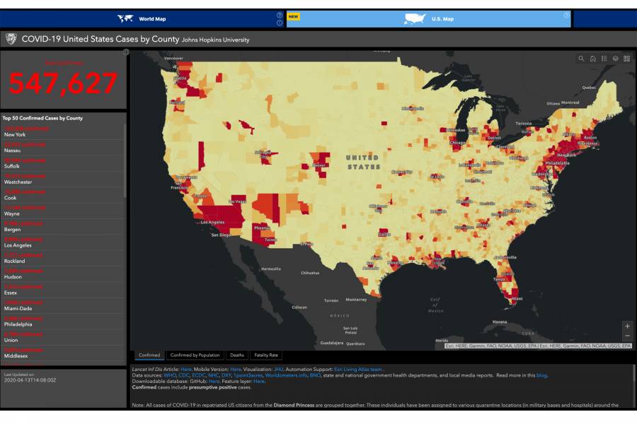
Johns Hopkins University has launched a data-rich, U.S.-focused coronavirus tracking map, adding to existing efforts that have made the university a go-to global resource for tracking confirmed cases of COVID-19 and related data over the past three months.
Created through a multidisciplinary collaboration by experts from across Johns Hopkins, the new map features county-level infection and population data, allowing policymakers, the media, and the public to find specific, up-to-date information about the outbreak and how it is affecting communities across the nation.
"Having this kind of granular data and contextual information going forward will help public health officials and governments make data-informed decisions about whether additional resources are needed or, in the future, whether social distancing measures need to change," says epidemiologist Jennifer Nuzzo, a senior scholar at the Johns Hopkins Center for Health Security.
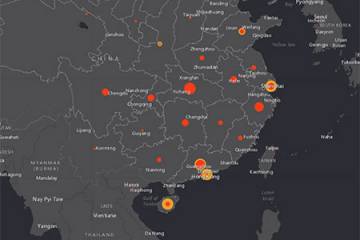
The new U.S. map builds on and complements the COVID-19 Global Tracking Map, which was originally developed by associate professor Lauren Gardner and her team at JHU's Center for Systems Science and Engineering. That map, launched on Jan. 22, quickly became an internationally trusted resource for understanding the evolving epidemic in near-real time. The global map continues to serve as a valuable resource for tracking the novel coronavirus outbreak as it unfolds around the world, and it recently added new functionality to reflect U.S. testing and hospitalization rates on a state level, incidence and mortality rates on a global level, and U.S. state case curves.
The new U.S. map overlays key demographics and socioeconomic indicators over the epidemiological data. New functions added as part of the U.S.-specific map include:
- Maps that allow users to see the density of the outbreak and its effect on counties
- The type of stay-at-home policy that is in effect and when it was put in to place
- County-level confirmed cases and deaths compared to the state levels of each
- State-level testing data
- County-level race and ethnicity data and poverty rates
- Health insurance rates by age group by county
- The number of residents per county in the highest risk age category (older than 65)
- Hospital capacity data, including baselines of licensed beds, staffed beds, and ICU beds
A number of these new data enhancements—insurance information, poverty rates, and demographic information, in particular—will help fuel future research about the economic impact of the pandemic, says Beth Blauer, executive director of the Johns Hopkins Centers for Civic Impact. Information about hospital capacity and staffed beds will help alert officials to shortages in health care staff and resources.
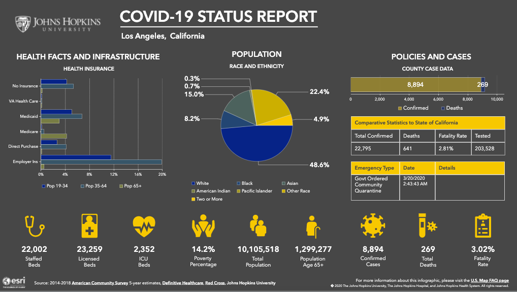
Image caption: Functions of the U.S. map include county-level infection and population data. As of April 13, Los Angeles County, for example, has 8,894 confirmed cases of COVID-19 and 269 deaths, for a 3.02% fatality rate. The county has 2,352 ICU beds and about 1.3 million people over the age of 65.
Image credit: Johns Hopkins University
"This map wouldn't have happened without Dr. Gardner and her data," Blauer says. "It's also important that Dr. Gardner made the foundational decision to not only create a map that tracks disease progression and attributes, but to make all the data public. Because she made that decision about the governance of the tool, everyone can understand her team's methodology for collecting the data, and people can tap into the map and create their own versions."
The tracking map's data powers a number of external research and visualization efforts by prominent media organizations such as CNN, The New York Times, The Guardian, and the Associated Press. But its data is also used by smaller organizations, such as Blauer's data team at the Centers for Civic Impact. Drawing from Gardner's map and data, Blauer's team had created data dashboards that would inform local government partners. Through this close collaboration with Gardner's team and with support from the university and the Johns Hopkins Applied Physics Laboratory, the U.S. tracking map and its expanded functions were developed.
"We wanted to provide just a little bit of context to the data so people understand the types of communities we have across the country, but also the impact that this kind of global pandemic can have on them," Blauer says.
Nuzzo can personally attest to the map's value as a public health tool: in conversations she's had with policymakers around the world, data from the global map has often been discussed or cited when developing policy decisions.
"I think that is a testament to how useful the tool is and how valued the efforts behind it are," Nuzzo says.
The new map is built and maintained by a cross-disciplinary team of individuals from the Johns Hopkins Centers for Civic Impact, the Applied Physics Laboratory, the Bloomberg School of Public Health, and the Whiting School of Engineering. Technical support is provided by ESRI and the JHU Sheridan Libraries.
"Our goal is to help maintain global situational awareness of the COVID-19 global pandemic," says Tamara Goyea, a senior data scientist at APL who is involved in the map project. "My involvement in this project has exposed me to the true nature of the virus and its impact on individuals, families, and communities—which has only increased my desire and determination to help further awareness and understanding of the pandemic."