You're about to launch your company and spend a pretty penny on logo design. You want shoppers to perceive your brand as young, trendy, and cool. "But what kind of logo design goes along well with those ideas?" asks Haiyang Yang, an assistant professor at the Carey Business School.
Yang, an expert in consumer psychology, partnered with colleagues from several universities to examine the connection between logo and personality. They created a series of studies in which they showed participants pairs of nearly identical logos designed by the researchers, with one symmetrical and the other asymmetrical. They asked respondents to choose, from a list of adjectives, the words that best described the logos and to rate how exciting they found them. The majority of participants found the logos with asymmetrical designs to be more exciting than those with symmetrical designs. In additional studies, the researchers manipulated brands' personalities, through taglines or keywords, to appear exciting. Here, too, participants gave higher marks to those with asymmetrical logos. It's a pattern the researchers dubbed the "visual asymmetry effect."
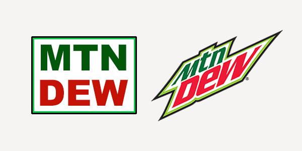
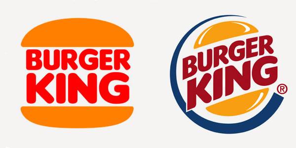
Yang says companies looking to project fun and enthusiasm with their brands should incorporate asymmetrical elements—protruding lines, off-balance shapes—into their logo designs. He points to the Mountain Dew logo and iconic Nike swoosh as examples that match the brands' intended personality. He also points to Burger King's logo overhaul in the late '90s, from horizontal text between simple yellow buns to the upward tilt of the whole design, as an example of how small tweaks can breathe new life into a decades-old brand. But, he warns, asymmetry isn't always the best move. If a brand's personality isn't meant to be exciting—an insurance company or a bank, for example—then a symmetrical logo proved to be the more effective design, as respondents felt it to be more sincere or competent.
In another study involving the actual logos of some of the top brands in the world, the researchers showed the visual asymmetry effect at play in the marketplace. Surveys revealed that brands with asymmetrical logos that were also perceived to be exciting, such as Amazon, Apple, Coca-Cola, and MTV, enjoyed higher brand equity, or more favorable consumer opinions, than those that did not. Financial data also demonstrated that these brands enjoyed higher valuations than their competitors.
Yang, whose previous work looked at the impact of counterfeit goods on the brands they copy, hopes to examine other aspects of logo design in follow-up studies, including how someone's culture impacts his or her perception of a logo. He points to consumers in the Middle East, for instance. Both Hebrew and Arabic are read from right to left, so would consumers there perceive a company's logo differently than would someone accustomed to reading left to right? "Symmetry is just one aspect of visual design," he says. "If you think about any kind of logo, there is an orientation to it, possibly a downward slope or an upward slope. There are all sorts of fundamental properties of visual design that could influence decision-making." In other words, would consumers feel differently about Nike's swoosh if it pointed down instead of up? That's perhaps one more thing for Yang to look into.
Posted in Politics+Society
Tagged marketing, consumer behavior