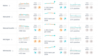
The Johns Hopkins Coronavirus Resource Center is now providing COVID-19 testing data for the United States from publicly reported sources, a service that replaces the COVID Tracking Project's year-long collection effort, spearheaded by The Atlantic, that ended March 7.

Image caption: The Coronavirus Resource Center will now be the home to the COVID Tracking Project's testing data.
The CRC is adding state testing data collection to its existing, year-long effort of providing analysis and visualizations about testing from leading public health experts. The CRC is working in coordination with the COVID Tracking Project team to ensure a smooth transition for the entities that rely on the data.
The Coronavirus Resource Center's files will include COVID Tracking Project data up to March 3, and JHU-collected data from that date forward. The data dictionary details all the variables' name equivalences to match COVID Tracking Project to Johns Hopkins names.
Differences in how Johns Hopkins classifies tests compared to COVID Tracking Project may result in sudden shifts in the seven-day rolling averages of test positivity for several states. The calculation changes implemented on March 3 will appear as spikes in positivity. These reasons for the artificial jumps will smooth out over time:
- California, Texas, Kansas, Missouri, Oregon, Pennsylvania, and New York: Johns Hopkins extracts data from counties, which have more timely information than state agencies. COVID Tracking Project pulled data from the states.
- Alaska and Florida: Johns Hopkins includes non-resident data while COVID Tracking Project previously counted state residents only.
The CRC is providing an up to date, read-only version of testing data in JSON programming language format. This API contains only testing data at this time.
The CRC has provided a continuously updated source of COVID-19 data and expert guidance since the pandemic began in January 2020. Experts aggregate and analyze the best data available on COVID-19—including cases, deaths, tests, contact tracing, and vaccinations—to help the public, policymakers and healthcare professionals worldwide respond to the pandemic.
Posted in University News
Tagged data visualization, coronavirus, covid-19


