

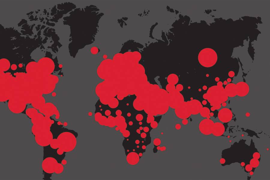
Several days before the World Health Organization first used the word "pandemic" to describe COVID-19, the red dots on the map had already declared it to be so. On the online dashboard created by two Johns Hopkins engineers, the dots punctuated a gray and black map of China, illustrating new cases of the virus as small clusters, then bright-red masses. Next they spilled across national borders, uncontained: visual confirmation of a looming global crisis.
By the start of March, Lauren Gardner, the associate professor of civil and systems engineering who created and oversees the map, knew she had to change its default view for the already millions of daily visitors. Instead of zooming in on China, the screen would now expand to show the entire world.
"I put it off for a while because I knew as soon as we did that we were telling the world this is now a pandemic," Gardner said in an April interview, conducted through Zoom as she took a pause from her near round-the-clock work. "I knew that when people refreshed their screen and all of a sudden they see the globe and not just a country, they were going to interpret that differently."
The interactive dashboard was less than two months old then, but already it was one of the most trusted COVID-19 resources in the world—ubiquitous in news reports and social media posts, and a guiding star for scientists and politicians. Gardner, co-director of JHU's Center for Systems Science and Engineering, created the live disease-tracking resource along with a doctoral student, Ensheng "Frank" Dong. They realized quite quickly that this project was a juggernaut, commanding their undivided attention. "From almost 24 hours after we made the dashboard publicly available, it's been 150% of our time," Gardner says. "We've dropped everything else we were working on and it's been all-consuming."
Later in the spring, the university added some two dozen more people to the team coordinating the map project, as its webpage was pulling in more than 3 billion data requests per day. In the month of March, the page attracted more total visits than the websites of the CDC or The New York Times. The phrase "according to Johns Hopkins" had become the parlance for citing the case numbers and death tolls from the novel coronavirus, which the map tracks in near real time.
According to its creators, the map represents a groundbreaking innovation in our ability to visually monitor a mass outbreak as it's unfolding. The viral popularity of the resource speaks to the hunger right now for reliable, objective data on COVID-19—data people can see. "This is the first time social media, combined with technology and information in real time, has been in a position to make this happen," Gardner says.
As Gardner, Dong, and others devoted their existence to the project, the red dots on the map inevitably reached the United States. Dong, whose family is based in China, knew what was coming. Gardner says she never found a clearheaded moment to take stock of the actual outbreak encircling her physical world. "I'm so absorbed with the work that I'm not really registering the reality of the pandemic—even though I'm working on it very directly," she says. "It's a very ironic position I feel like I'm in."
Maps of this kind are not Gardner's specialty. "So, I don't do data collection visualizations, right? That's not our thing," she says of the Center for Systems Science and Engineering. "We do mathematical modeling and risk analysis."
Part of the Whiting School of Engineering, the center is founded on systems science, a modeling approach that explores how various parts of a whole event—engineered, behavioral, and natural—impact each other. Epidemic preparedness has been one focus, along with topics like public transit and autonomous vehicles. CSSE unites researchers from numerous disciplines across Hopkins, including public health, medicine, infrastructure, information security, disaster response, and education. Gardner joined CSSE in 2019 but collaborated often with its researchers in the years before, from her lecturer post at the University of New South Wales in Sydney. Raised in Texas (her Twitter handle is @TexasDownUnder), she studied at University of Texas at Austin for both her bachelor's in architectural engineering and master's in civil engineering.
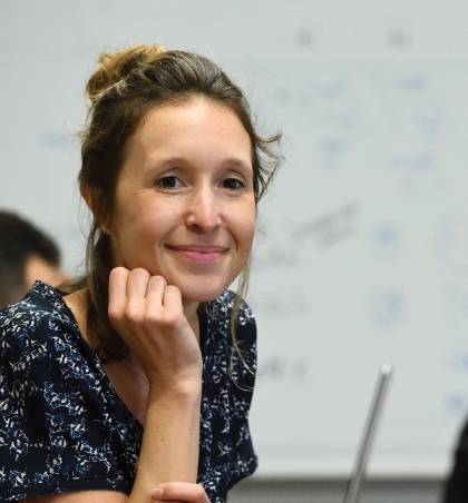
Image caption: Lauren Gardner
Image credit: Will Kirk / Johns Hopkins University
Gardner's expertise lies in modeling the spread of infectious diseases such as Zika, dengue, bird flu, and measles. She's especially focused on the intersection of epidemiology and transportation—how airplane and shipping routes, for example, or border control policies, can influence outbreaks. In Sydney, she and her colleagues coined the phrase "biosecure mobility" to describe this line of research, exploring how both natural disease and man-made biothreats can follow the movement of people and things around the globalized world.
In the COVID-19 pandemic, a moment when scientists like Anthony Fauci, Deborah Birx, and Scott Gottlieb have become our new pseudocelebrities, Gardner has found herself in a curious spotlight, juggling and often fending off a constant wave of media requests. At one point, she turned down CNN's Anderson Cooper. "We're getting multiple asks from amazing journalists and outlets every day, not to mention direct contact from government departments and organizations that are using our data to make decisions," she says.
The map has many influential followers. It has served as a central data source in the "room" of the U.S. Department of Health and Human Services. When President Trump first announced his call for social distancing, he stood in front of a chart based on Hopkins figures. The dashboard's numbers also form the basis for the prominent COVID-19 modeling done by the University of Washington Institute for Health Metrics and Evaluation, which has informed top researchers and the federal government.
In March, Denis Wirtz, vice provost for research at Johns Hopkins, tweeted that the map's significance for policymaking "is impact most academics can only dream of."
"It's huge, and that's rewarding and important," Gardner agrees. But celebrity can wait. "We just don't have time for it all. We're not sleeping much."
Dong worked afternoon into night on January 21 to construct the platform over the course of seven or eight hours. At a time when the news from China still felt distant for many Americans, his own family there—in the Shaanxi province, near Beijing—was feeding him firsthand accounts of the pandemic and their lives under the dystopian-like lockdown. "My family was very cautious," Dong says. "They got the masks and stayed at home and didn't go anywhere. They had stockpiled food because the pandemic happened right before the holiday, the New Year."
Both Dong, a first-year PhD student in Civil and Systems Engineering, and Gardner, his thesis adviser, knew this was research-worthy. "We talked about how serious the situation was in China, and she said, do you want to create something?" Dong recalls.
He turned to the same ArcGIS mapping technology he and Gardner had previously used to build a tracker predicting measles hot spots in the United States. The visual design for the COVID-19 map was intentionally simple and intuitive: red circles contrasting against a black and gray background, with large red numbers in side columns tracking confirmed cases and deaths from COVID-19. Dong and Gardner would manually fill in data from the DXY, an online platform run by the Chinese medical community.
They publicly shared the dashboard the following morning. It tore through social media, and by afternoon PBS, The Washington Post, and other major news sites had featured it.
"It went viral pretty quickly," Gardner says, and it was clear just as quickly they couldn't keep up with the pace of data curation. So they brought in Hongru Du, another PhD student in Civil and Systems Engineering, to help with input and later coding. They also switched over to a semiautomated system for data input, aggregated through GitHub, with their sources expanding vastly to include WHO, news reports, and health agencies and disease control centers around the world.
The team made its headquarters the common area of Latrobe Hall on the Homewood campus, working around a conference table. Gardner sometimes brought along her new puppy, a Bernadoodle she and her husband named Tim Tam,after the Australian cookie. But this was work they also took home with them—and on walks, during dinner, in showers and dreams.
"When I first joined, I didn't know the map would be so popular," Du says, describing it as a full-time commitment that creates work into the pre-dawn hours. Like Dong, his family is in China, in the southern city of Kunming, so he understood the threat but didn't necessarily believe it would overwhelm the U.S. "At the starting period of the outbreak, it seemed maybe the U.S. wasn't paying attention," he says. "As numbers started going up, we saw huge jumps in users."
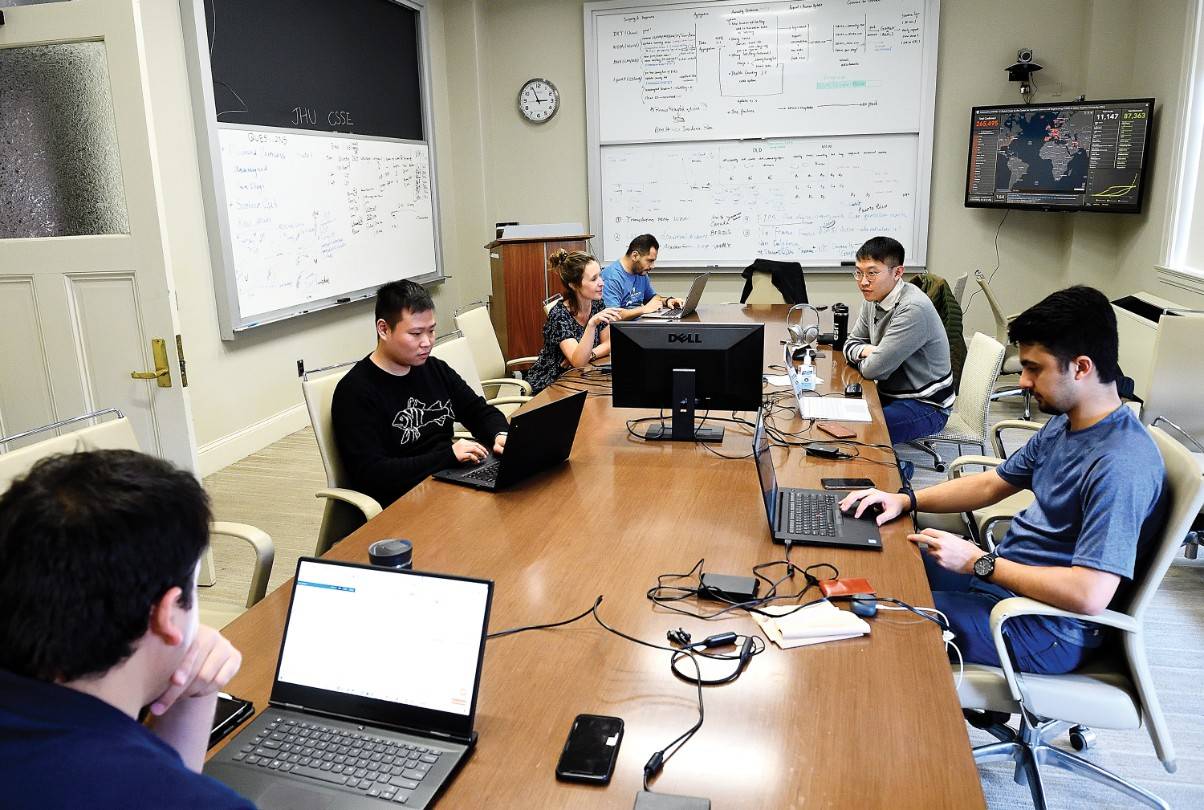
Image caption: In the early days of the global pandemic, the COVID-19 dashboard team would work in a conference room in Latrobe Hall. Pictured here: Ensheng Dong (second from left), Lauren Gardner (third from left), and (continuing clockwise) Hamada Badr, Hongru Du, Fardin Ganjkhanloo, and Farzin Ahmadi.
Image credit: Will Kirk / Johns Hopkins University
Visits to the site soared as Italy and Iran faced dire outbreaks. On April 2—the day cases of COVID-19 passed the million mark worldwide—the map drew more than 12.7 million page views to its site at coronavirus.jhu.edu, its peak day thus far. As CSSE announced this, Gardner remarked on Twitter: "I feel uncomfortable 'liking' this tweet, so I'm just going to re-circulate it instead."
The map's server has crashed several times under strain from intensive use, each time bringing a storm of frustration from thwarted users. No matter the cause, the map not loading prompted consternation. "Has the Johns Hopkins map of the coronavirus stopped working for other people, or just me?" tweeted Ken Cuccinelli, acting deputy secretary of Homeland Security, on February 24, garnering thousands of retweets and "likes."
Glitches and blunders have been inevitable, like the day in February when dozens of cases of COVID-19—associated with the Diamond Princess cruise ship—popped up on the map in Kansas, alarming locals there. (After modifying that, the map team explained that they'd used that spot at the center of the U.S. to track cruise passengers with unknown locations after de-boarding.)
At every turn, Gardner and her colleagues are bombarded with feedback through emails and social media, ranging from high praise to petty nitpicks and unhinged threats. "We get a lot of gratitude and thanks, and that's helpful," Gardner says, "but humans like to complain and don't realize they're emailing actual people who are working really hard to do this public service for free." Some emails, she says, are "pretty mean."
Also see
Some have remarked that the map's visual presentation is inherently ominous: With its red circles now clouding much of the globe, it looks like some kind of world-domination game. Gardner says the choice of red was not intended to invoke fear. "But it would be weird to make an outbreak bubble Easter green."
By early April, the map project started to morph into something much larger, with support from more CSSE students, staff from the Applied Physics Laboratory, and data services from Sheridan Libraries, in addition to continued help from Esri, the company providing the map software. Meanwhile, a cross-disciplinary group at Hopkins, led by Beth Blauer at the Centers for Civic Impact and including the Bloomberg School of Public Health, has created a suite of new tools based on Gardner's map, including data visualizations of the pandemic's trends and a U.S.-focused map offering data at the county level. The National Science Foundation pitched in a $200,000 grant toward the mapping project in April.
With the extra support, Gardner's core team at CSSE has been able to refocus on the type of work that's been their traditional bread and butter. "There's less pressure on the data curation side, and much more on doing actual risk assessment and modeling for the current situation in the U.S.," Gardner says. "That has a totally different sense of urgency to it than us making sure the dashboard doesn't fall apart."
Her team is currently trying to forecast new spatial hot spots for COVID-19, so agencies like FEMA can roll out resources in the right locations at the right times. They're also trying to quantify the impact that social distancing has in flattening the outbreak curve.
With social distancing now common practice, Gardner and her team have fully transitioned their work to Zoom. They spent their last days in Latrobe Hall in April, safely spaced around the conference table. Gardner said then that the walk from her house to Homewood, coffee in hand, was often the only time of day she had to herself.
Dong laments that he and his colleagues were among the few to experience the spring blooms on the campus, now largely deserted and starkly silent. "One thing I feel sad about is that there were very few people here," he says. "We were enjoying the flowers."
Posted in Science+Technology
Tagged coronavirus, center for systems science and engineering, lauren gardner