

Molly Warnock wants to bounce an idea off the students in her Surrealism class. It's late March, and the history of art associate professor has assembled the 19 students in a Brody Learning Commons classroom where she, teaching assistant Ben Gillespie, and art history librarian Donald Juedes have arranged tables into improvisational display cases. Masking tape marks off sizes and shapes corresponding to the three vitrines on the Eisenhower Library's M-level where book exhibitions rotate throughout the year. Warnock's students are putting together Surrealism at Mid-Century, which will run through June. It's a look at selected surrealism journals held in the Sheridan Libraries' special collections. The students did the research on the journals, wrote the wall text and copy labels that will accompany the exhibition, and will decide if they approve the thematic groupings and layouts of the pieces that Warnock and Gillespie have put together based on their research.
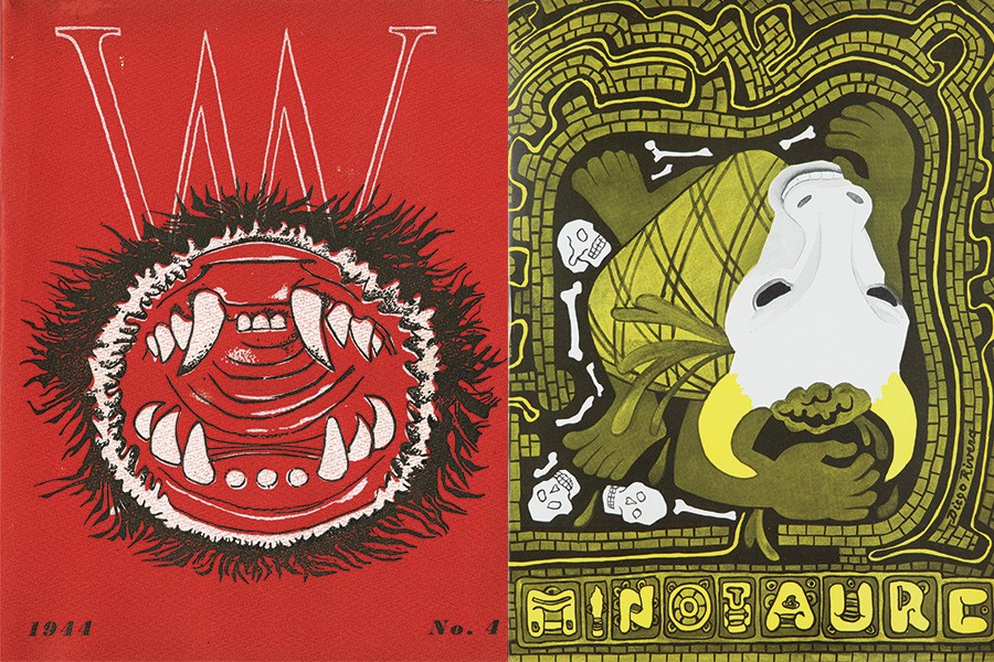
Warnock has an idea for one object. "Over here we have, of course, the most lavish and innovative experimental issue that was ever done of triple V," she says, pointing out the fourth edition of VVV, which was published in 1944. Based in New York, the journal was an outlet for the European artists who had fled World War II and settled in that city. Its covers were designed by Max Ernst, Marcel Duchamp, and Roberto Matta, and its contributors included first-generation surrealist artists such as André Masson, Benjamin Peret, Joan Miró, Leonora Carrington, and André Breton, the movement's founder. The issue Warnock is talking about has a lovely lime green cover with one section cut out, replaced by chicken wire.
"This was actually something that was not proposed, but we did feel that the back cover here is so spectacular, with the combination of the beautiful green color and then the use of the innovative material," she continues. "And one reason we put this out here is the possibility [Juedes] raised of building a support for it that would allow us to show it partially open, such that we could get a sense of the cover and the back page, and maybe even some interior pages."
The students watch Warnock as she demonstrates the idea, holding the journal vertically and partially open. A few exchange quick thoughts. "It's just a possibility," Warnock continues. "So what do we think? Should we discuss?"
Students start asking questions, and ideas are suggested, discussed, given more shape. This back-and-forth is part of the process of student-curated exhibitions, indicative of the collaborations not only among professors and students but the interdepartmental coordination it takes to put these projects together.
The students spent the first half of the semester in teams researching a selection of journals and presenting to the class three possibilities per journal for the exhibition. Then Gillespie and Warnock looked at the examples to determine if there was a narrative.
"What we have—and have in ideal exhibition copies—are really great journals from the late 1930s to the early 1950s, often being produced either outside the historical capital of surrealism, Paris, or within Paris by surrealists from other centers, often of a younger generation, who are coming to Paris," Warnock tells the class, presenting an overview of the examples that she and Gillespie have laid out from the students' ideas. "So what we have, in a sense, is surrealism at a moment of voluntary and involuntary dispersal, brought about in part by the war and by the ways in which people are emigrating immediately after the war."
She then goes over how and why they have grouped the items and, working with the students, starts moving the items around, picking different layouts, talking about where labels should go and how to present the materials. They talk about how to display N.E.O.N., a broadsheet journal published in Paris in 1948 and 1949, so as to best spotlight its eye-grabbing layouts and typeface treatments. Warnock asks the team that proposed Dyn, a colorful perfect-bound journal published in Mexico City from 1942 to 1946, about other page views and covers they liked. All the selections are little windows into a 20th-century art movement's specific times and places, a glimpse into what the people involved were thinking about visually and politically.
It's a collection that didn't exist in its current state about 15 years ago, when Sheridan librarian Sue Waterman received a catalog from a rare book dealer in Amsterdam that included a few examples of small-print-run avant-garde journals. She found them visually and intellectually interesting, and decided to see if Johns Hopkins had any in its collections. "The more I looked, the more I realized we had a few," she says. "I was amazed that someone, somewhere—I don't know when, how, or who—bought these things."
She started slowly adding to the collection, remarking that the items, as they came up, were relatively affordable. Today she has built the collection into about 150 titles of avant-garde, Dadaist, and surrealist journals from the late 19th century through the 1970s. It's not exhaustive or highly specialized—the University of Iowa Libraries' International Dada Archive would probably be the first stop for any researcher interested in that time period—but it is well-curated and expansive, including original artifacts, bound editions, or digital copies of the Lettrism journal La Lettre, Austrian satirist Karl Kraus' legendary Die Fackel, the Amsterdam-based De Stijl, the Kurt Schwitters–edited Merz, the renowned Latin American journal Sur, the journal of the College of Pataphysique (a post-WWII Paris group that included some of the more impish writers of the era, including Boris Vian and Raymond Queneau), and the intense Georges Bataille–edited Acéphale.
Waterman notes that when she first started poking through the libraries' journal holdings, "some were still in the general collection and not in the rare books, which made sense," she says. "They're 20th-century materials, and the definition of 'rare' as far as special collections goes is pre-1801. So 1920 isn't rare, although these journals are very ephemeral and fragile and rare—and now valuable."
All are treated with the respect of rare items, which is why Crystal Maitland, a paper conservator in the libraries' Department of Conservation and Preservation, stops by the class. She wants to let the students know what is and isn't possible with the exhibition cases. Two of the vitrines sit near a source of natural light, and the inks on many of these journals are unstable and decay when exposed; facsimiles can be made, if need be.
But what about propping up VVV? "We could build a support for inside the cover," Maitland says, inspecting the journal, looking over its pages and covers. "That way all the plastic would support it, so it's not putting any weight on the binding. We can't make it absolutely flat because we don't want to damage the staples, but we could open it up a little further so it would end up looking something like this."
She shows how it might look, and Warnock and the students imagine what might be on either side of it, discuss moving it to the other side of the case to add some color to the presentation. Warnock and a few students do some shuffling, then take a step back and see how it looks. Much better.
"OK?" Warnock asks, looking around the room and noticing the students nodding their heads yes. She then directs them to a different part of the display. "Since we have Crystal here," she says, "let's talk about these journals over here."
Posted in Arts+Culture
Tagged sheridan libraries