

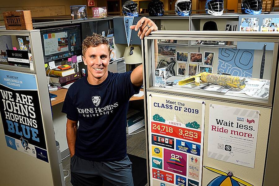
All across the Johns Hopkins campuses, just about anything you see involving graphic design—from posters to Blue Jay Shuttle graphics, to the Homewood Field end zones—features the work of Kenny Carter.
As a senior graphic designer in the Johns Hopkins Office of Communications, Carter works to maintain a clear and consistent aesthetic for JHU's visual brand, over a huge range of print and digital materials. It's a job that combines artistic instincts with a patient, nearly obsessive attention to detail.
We sat down recently to talk with Carter about his wide-ranging work, which has included crafting paper mutton chops and spending time inside an odiferous mascot costume.
What type of things do you design for Hopkins?
The stuff I create includes print and social media collateral, environmental graphics, videos, permanent displays. It's creating designs for everything from postcards to stadium signage.

A lot of my work is focused on Admissions—that's my No. 1 priority. Athletics is the most fun, and the President's Office is always a high priority. Often I'm brought in for large campaigns that need some creative design ideas, something like Pedestrian Safety, the Lyft/Blue Jay shuttle partnership, or Hopkins Votes.
There's no clear-cut "Kenny only does that." I pride myself on being a person who never says, That's not my job. If someone needs a skill set I possess, I lend it to them.
What's a favorite project you can recall?
Last year, the design team was asked to create postcards for Admissions, for students who were accepted into Hopkins but hadn't yet confirmed attendance. The postcards were kind of meant to "poke" as a reminder, and the students could mail them onward to family members as a way to announce, I'm going to Hopkins!
But I couldn't stop thinking that any high-schooler these days isn't going to want to send anything through snail mail. They want to send something on their phone.
So we created something more interactive, but still tactile, that students could take photos of and share on social media. We sent them cutout props, including a pair of embellished sunglasses and the mustache and mutton chops of [first JHU President Daniel] Gilman. Our writer, Amy Lunday, dubbed the mutton chops "HopChops."
The project won a grand gold in the CASE Circle of Excellence design awards.
What's the most time-consuming project you've worked on?
Definitely the year-end "thank you" videos from [Johns Hopkins University President] Ron Daniels. I've directed that for about five years. They take months to put together. It involves creating all sorts of props and graphics, scripting scenes, the logistics of scheduling hundreds of different people, and crossing our fingers for good weather.
Sometimes your work involves travel—can you tell us about creating the Rivalry trophy, aka the "crab trophy"?
I was tasked with creating this trophy to track the most storied rivalry in college lacrosse—between Hopkins and the University of Maryland. Because we're all in Maryland, the idea was, Why don't we use a crab? So the two schools got a company in Baltimore to create a large crab out of reclaimed wood.
There was an idea for putting stickers of the university logos on the crab, but I convinced them this trophy needed more grit. I wanted the wording burned into a wooden base. So I found these amazing guys who do laser etching in Pennsylvania and took a road trip up there with one of our video gurus, Dave Schmelick. For two days we hung out with the crew; we all worked together using really neat equipment. The result has a lot more character than just a slab of wood.
So how long have you worked at Hopkins, and how'd you get started here?
I've been at Hopkins since I was a junior in high school, working as a summer intern back in 2002. My mom [Sue Carter] worked here as a benefits manager. She retired last year as director of benefits, after 46 years. I admired my mom's work ethic, attention to detail, and company loyalty, but I knew, with certainty, I wanted nothing to do with benefits.
My first two summers, I worked in payroll. But my background is in graphic design—I studied it in middle and high school, both magnet schools, and as my college major. So my next two summers I worked in the office then known as Design and Publications, scanning film slides.
Full-time, I've been working at Hopkins since I graduated college in 2007, starting as a junior graphic designer.
What are some of your pet peeves in the graphic design world?
One is a lack of type sensitivity, when more attention is paid to an image or a logo than the type. Also, when people just choose random fonts and rely on flashy gimmicks to embellish them, as opposed to whittling down for a "less is more" approach.
More broadly, there's a problem when any piece is designed without thinking about the audience it's intended for. The best two pieces of work advice I ever received were from Jay Corey, former director of video here. He said, "Read the room" and "It's not about you." As a graphic designer for Hopkins, you're more focused on your client's needs than your personal preferences.
Going back to fonts for a second—what are your favorites? Which do you use the most?
My favorite is Futura. But "favorite font" is difficult because the way I approach design—I'm looking at the message my client wants, so font selection will match with that goal.
At Hopkins we stick with four fonts for our design work: Quadon, Titling Gothic, Arnhem, and Gentona. Every print material you see at Hopkins features one or more of these fonts.
Who's checking you on that?
I'm one of three people who are the unofficial font police of the university, in the Office of Communications. We enforce the consistency of fonts, among other visual brand guidelines. But I bounce any issues I run across off my immediate boss, Greg Stanley, who was also one of my professors in college. Greg and I are usually of one brain with the guidelines.
Lastly: You've had a lot of experiences with the Blue Jays mascot, right?
For various projects, I've worn that suit however many damn times. The first time I had to try it on, for a video shoot, it was damp and stunk like a shoe. I'm a high school wrestling coach, so I know what funk smells like; however, this funk was horrendous. Afterward, when I brought it back to Athletics, I learned the costume was last worn over a week ago. So it was still damp after a week of being crumpled up inside a bag. I almost threw up.
We're currently designing a new mascot uniform, which involves bringing my 2-D sketch to a company to make into the 3-D real thing, with all the fur and stitching. The new one will match our updated Blue Jay logo, anatomywise, colorwise, etc., but with a friendlier look than the logo. We should be unveiling that at the start of the 2019 lacrosse season.
Posted in News+Info
Tagged who does that?