

This week, Hopkins' new Technical Communication Lab opens. Housed in the Whiting School of Engineering's Center for Leadership Education, or CLE, the lab will serve students who would like to improve their communication and data visualization capability. The lab's team of consultants lead individual and group consultations in technical writing, oral presentations, conversational and written English for nonnative speakers, and data visualization and design.
The center began consulting with non-native English speakers in 2009 but was soon in demand among native English speakers for their services. Expanding the lab will allow the center to scale and meet that demand.
"I am excited that we will be able to help to many more people than we were able to in the past," says Julie Reiser, director of the CLE's Professional Communication and Professional Development programs, and the driving force behind the lab's opening. "The creation of the TCL will really help us address this gap and allow us to help all STEM writers who struggle with grammar, punctuation, clarity, presentations, posters, and translating their thoughts into clear ideas."
For a sneak peek of the lab's offerings, the Hub asked Reiser and Amanda Hilliard, lecturer and manager of the Technical Communication Lab, for advice on delivering effective presentations, displaying data, making complex ideas accessible to a general audience, and more.
What tips do you have for making complex, "science-y" writing accessible to a wide audience?
Hilliard: Start by thinking about what your audience really cares about. A technical audience may want a lot of background information and all the details of your methodology, but a general audience wants to know how your research affects them personally. Therefore, when you write for a wide audience, you should frontload key results and highlight their significance for your audience's day-to-day life. For your writing style, avoid using excessive technical jargon; instead, use analogy, metaphor, and relatable examples to make complex scientific information more digestible.
What are the most common mistakes presenters make when presenting their research?
Reiser: The single biggest piece of advice I tell any speaker is: You need to tell the right story to the right people at the right time if you want to be heard. Most people make the fatal mistake of creating one, and only one, story about their research. Then, they tell that one story everywhere they go. But every audience is different and has a different set of needs. If I'm trying to tell you a story that doesn't pertain to you, you'll immediately sense this and become bored, unresponsive, and (sometimes) hostile. If I tell you a story you're interested in, you'll still pay attention, stay focused, and think of ways to connect to my work.
How do graphics enhance a research presentation? Are there any mistakes presenters should avoid when incorporating graphics into their presentation?
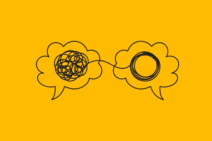
Reiser: Graphics are a double-edged sword in presentations. People are always compelled by visual elements, but a lot of researchers make the mistake of thinking that any graph, chart, or data visualization is easy-to-understand and compelling. Some researchers also make the mistake of using too many graphics and muddy their overall message. To be helpful, a graphical element must be germane to the story, fit into the overall narrative flow, and be delivered in an audience-friendly way.
A room full of non-experts doesn't want a long series of intense graphs with lots of error bars, and gridlines or multiple graphs that appear to be nearly identical. They just want one big graph where you can slowly walk them through the elements. Conversely, a room full of experts might very well want more graphs with a denser level of information. But, even then, most people today err on the side of using too many graphs and too many equations. Sometimes, less is more. And, again, it always comes back to telling the right story to the right people at the right time. And part of telling the right story is curating the right amount of data so that it helps, not hinders, your main point.
What makes someone stop and engage with a research poster? What might make them turn and run away?
Hilliard: No one wants to face large blocks of text, so a poster that contains lots of small text without any visuals will make your audience want to run away. It's a poster, not a research paper, so pay attention to your data visualizations and overall visual design. To really make someone stop and engage with you, consider using additional visuals, such as videos of your lab setup or props like a medical device you designed. These can really pique someone's interest and let them see information that can't truly be captured with a poster alone.
Posted in Science+Technology, Student Life
Tagged communications, center for leadership education, stem education