- Name
- Johns Hopkins Media Relations
- jhunews@jhu.edu
- Office phone
- 443-997-9009
The long-term, systemic consequences of structural racism can be challenging to see, quantify, and communicate. But an online tool developed by Jaime Madrigano, an associate professor in the Department of Environmental Health and Engineering at the Johns Hopkins Bloomberg School of Public Health, aims to do all three.
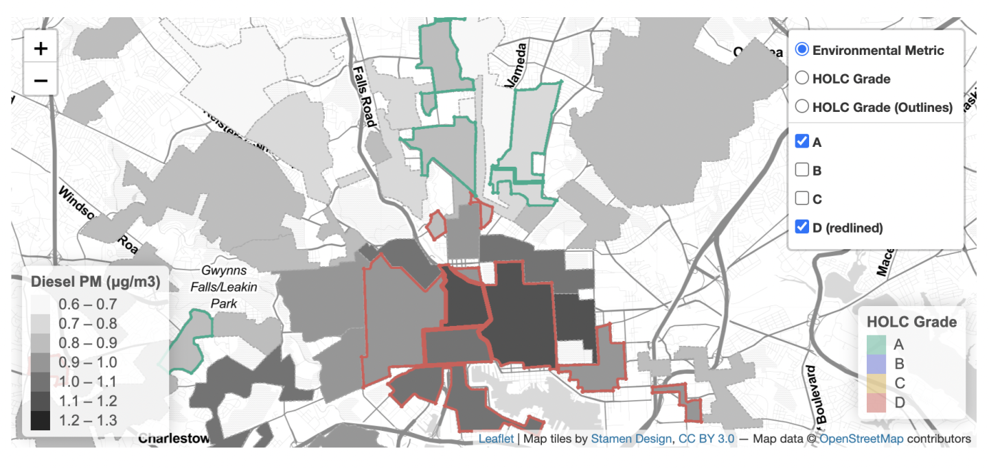
"Environmental Racism: A Tool for Exploring the Enduring Legacy of Redlining on Urban Environments" enables users to visualize the correlation between 14 contemporary environmental metrics and the practice of "redlining" that took place in the 1930s.
Redlining was "a discriminatory practice that denied access to lending to people in neighborhoods that were deemed 'hazardous' because of the proportion of minority and immigrant populations, low-quality housing stock, and other factors," says Madrigano, who developed the tool with colleagues from the RAND Corporation. Neighborhoods were put into one of four categories: Type A (Best), Type B (Still Desirable), Type C (Definitely Declining), and Type D (Hazardous), with corresponding color codes of green, blue, yellow, and red, respectively. The categories were created by the Home Owners' Loan Corporation under the auspices of the federal government. Lending institutions used the corporation's codes and similar tools to make lending decisions. As a result, people who lived in "Type D" neighborhoods were denied access to mortgages and other economic opportunities.
"These practices had enduring impacts," Madrigano says. "Certain populations didn't have access to mortgages, so they didn't have access to homeownership, which is really the way that most Americans build personal wealth and intergenerational wealth. Those practices resulted in entrenched poverty and systemic, disproportionate burdens plaguing the same populations, over and over."
The tool allows users to combine a map from the National Archives depicting any of the approximately 200 communities in the United States for which redlining data is available with patterns of current environmental hazards and amenities such as air pollution, green space, and other environmental metrics.
The tool's documentation cites literature which connects those environmental factors to related health impacts. For example, it cites multiple studies that show a strong connection between air pollution exposure and reduced life expectancy, as well as respiratory and cardiovascular disease.

Image caption: In this map, the most poorly rated neighborhoods under the Home Owners' Loan Corporation (outlined in red) are shown to experience the highest exposures to diesel particulate matter, whereas the highest rated neighborhoods under the Home Owners' Loan Corporation (outlined in green) experience among the lowest exposures to diesel particulate matter.
Image credit: Environmental Racism: A Tool for Exploring the Enduring Legacy of Redlining on Urban Environments
Madrigano and her team deliberately included the term "environmental racism" in the tool's title. She defines the concept as an inequitable distribution of environmental burdens and amenities brought about by deliberate policies and practices, past and present.
"Some people bristle when they hear that term," Madrigano says. "But we wanted to steer the conversation away from environmental disparities by race or by income and focus on the actions that led to them. These were deliberate actions, policies, and practices, and they had long-term financial and health consequences."
For Madrigano, the most important takeaway from the tool is that environmental health is intertwined with issues of housing, transportation, infrastructure, and planning, and she feels tools like hers can help educate users on those connections.
"The environment, sustainability, and climate change are holistic issues where multiple sectors and stakeholders have to be at the table," Madrigano says. "When we talk about environmental health disparities today, we want to think about the deliberate actions that can undo those unjust burdens."
Posted in Health, Science+Technology
Tagged public health, data visualization, redlining, equity, housing


