


Image caption:
Catherine Pierre
Editor
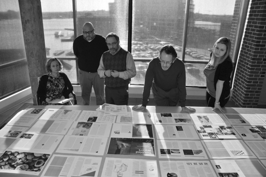
We all look so serious.
Really, we were having a blast. That morning, the staff got its hands on the first proof of the redesigned magazine. Until then we had seen snippets — the prototype, of course, then an illustration here, a layout there — but this was our first encounter with the full issue. As you can see from the magazine you're holding in your hands, it was gorgeous.
We had determined a few years ago to redesign the magazine, which hadn't been given a real overhaul in more than a decade. First we assessed what needed to change — and what we shouldn't mess with. After an extensive readership survey and a series of professional critiques, we understood that what people like the most are the magazine's deeply reported, thoughtfully written feature stories. Where could we use some improvement? Turns out we can be overly serious and needed to lighten up a little. Most importantly, we learned that our readers want more stories about Johns Hopkins University engaging the world around it. They want to read about big ideas, world events, and the research that is solving the world's most pressing problems.
We turned to designer Abbott Miller and his associate Kim Walker to visually translate that editorial focus. I think they nailed it! The cover design declares, "There's substance here!" The interior is clean, contemporary, sophisticated, and highly readable.
I hope you enjoy these redesigned pages as much as we did. Please leave a comment below to let us know what you think.

Catherine Pierre
Editor
Give us your feedback by sending a letter to the editor via email to jhmagazine@jhu.edu. (We reserve the right to edit letters for length, style, clarity, and civility.)